Navy suits demand tie colors that either pop or harmonize intentionally. Burgundy, red, and silver create confident contrast against white shirts, while steel blue offers subtle sophistication. Gray delivers refined elegance, and soft pink brings modern warmth. Pale yellows or cream should be avoided; they disappear into the background. Patterned ties outperform solids consistently: stripes, polka dots, and paisley add visual interest without clashing. Seasonal shifts matter too. Consider lavender for spring and deep burgundy for fall. Your shirt color guides everything, so let it lead your selection. Each color works differently depending on context and personal style, which varies by individual preference and occasion.
How To Choose A Tie Color (The Essential Framework)

Why does picking a tie feel harder than it should be? I’ve been there, standing in front of the mirror wondering if I’m making the right choice. Here’s what I’ve learned: use the color wheel as your guide.
Think of your navy suit and white shirt as your foundation. Now you’re looking for a tie color that either contrasts boldly or harmonizes subtly. Red ties command attention and express confidence. Silver or gray whispers sophistication and timelessness.
The framework is simple: consider contrast first. Your white shirt is solid, so your tie color should pop against it while complementing your navy suit. Don’t overthink this. You have the tools now. Apply them consistently, and you’ll make the right choice every time.
Let Your Shirt Color Lead The Decision
Once you’ve locked in your navy suit and white shirt, your shirt color is the foundation of this decision. Your shirt acts as the bridge between your tie and suit, so it deserves serious consideration.
With a white shirt, you’ll want ties that pop; think burgundy, red, or silver tones. They’ll stand out beautifully against both fabrics. Pink shirts call for textured navy, gray, or lighter purple ties instead. Light blue shirts pair well with navy striped or blue plaid options.
The key principle: your shirt color determines whether you’re creating contrast or harmony. Once you understand that relationship, your tie choice becomes clear. You’re not picking randomly anymore. You’re building something cohesive and intentional.
Use Contrast To Make Your Tie Pop

How do you make sure your tie actually commands attention instead of blending into your navy suit? The answer is contrast, and I’ve learned this through experience. When your tie color pops against that deep navy backdrop, you’re not just wearing an accessory; you’re making a statement.
Here’s what works:
- Red, burgundy, or pink ties create bold visual separation on white shirts
- Silver and lavender add sophistication while standing out clearly
- Patterned ties with stripes, polka dots, or paisley designs enhance contrast beautifully
- Medium to high contrast patterns work especially well with solid, simple shirts
I’ve noticed that pale yellows or cream ties disappear against navy. Avoid that trap. The goal isn’t just matching; it’s creating visual interest. When your tie color contrasts sharply with both your suit and shirt, you’ve got presence. That’s the difference between looking sharp and looking forgettable.
Pattern And Texture Beat Color Alone

I’ve found that when you pair a navy suit with patterned ties (stripes, polka dots, or paisley designs), you’ll create visual interest that solid colors simply can’t match. The texture and pattern work together to add depth and dimension to your outfit, especially when you combine them with a solid shirt that lets the tie become the real statement piece. Here’s what I’ve learned: a busier tie pattern over a crisp white or light blue shirt improves your overall look, making it noteworthy and polished without requiring you to chase trendy colors.
Stripes And Polka Dots
Patterned ties can elevate a navy suit beyond the ordinary. Stripes and polka dots add visual interest that solid ties simply cannot match.
Consider these options:
- Striped ties with navy and white or blue and silver offer contrast without clashing with your suit
- Polka dot ties introduce playful texture, particularly striking with light-colored solid shirts
- Medium-width stripes (around 3 inches) create balanced rhythm without overpowering your outfit
- Pattern scaling matters; ensure your tie’s design complements your shirt to maintain proportional interest
Textured or subtly colored patterns add dimension to your navy suit. You’re not just wearing clothes; you’re making a deliberate choice about how you present yourself. That’s what separates those who dress with purpose from the rest.
Paisley Textures Create Contrast
When you’re wearing a navy suit, solid colors alone can flatten your entire look. Paisley textures, however, offer a strategic advantage. Paisley patterns create visual depth without overwhelming your navy foundation. The intricate designs add sophistication while complementary colors (reds, blues, greens) work together harmoniously.
| Paisley Feature | Best For | Impact |
|---|---|---|
| Subdued colors | Formal events | Professional elegance |
| Smaller motifs | Daily wear | Refined subtlety |
| Rich tones | Smart-casual | Modern confidence |
| Mixed hues | Networking | Memorable presence |
| Classic designs | Weddings | Timeless appeal |
Balance your paisley tie with a solid shirt to avoid competing patterns. Choose ties with restrained color ratios and delicate motifs; they maintain sophistication against dark suits. This approach gives you versatility across formal and casual settings while keeping you looking polished.
Seasonal Tie Colors That Actually Work

Your navy suit doesn’t stay the same outfit year-round, and neither should your tie selection. Smart seasonal contrast shifts how you look and feel wearing the same jacket.
Timing matters. Here’s what actually works:
- Spring and summer: powder blue, lavender, and soft pink create fresh color combinations against your navy base
- Fall and winter: burgundy, deep red, and charcoal gray deliver sophisticated seasonal depth
- Material choices: linen and light wool for warmer months, silk year-round for polish
- Pattern play: floral sage green or dusty blue plaids add interest without overwhelming
Yellow and cream tones backfire. They blend with white shirts and kill contrast entirely. I’ve made that mistake. When you match your tie selection to the season, you’re not just dressing well. You’re showing you understand style belongs to the whole year.
Classic Blue Ties For Tonal Harmony

Blue ties with navy suits offer three distinct styling paths, each with its own appeal. Powder blue provides subtle contrast that keeps things refined without demanding attention. Steel blue brings complementary depth that feels both sophisticated and grounded. Navy itself creates that sleek, tonal look where texture and fit become your real statement makers. Pick whichever matches your comfort level, whether you’re after understated elegance or polished cohesion.
Powder Blue Subtle Contrast
How do you add sophistication without shouting for attention? Powder blue is your answer. This shade creates gentle contrast against a navy suit, offering that refined look you’re after without overwhelming the ensemble.
What makes powder blue work:
- Pairs perfectly with white shirts for crisp, professional brightness that commands respect
- Complements light gray or charcoal suits if you want versatility beyond navy
- Works wonderfully with brown or tan shoes to keep your palette warm and balanced
- Comes in solid, textured, or subtle stripe patterns for adding depth without drama
Powder blue sits in that sweet spot between bold and understated. It signals you understand style nuances without trying too hard. You’ll look put-together, approachable, and confident; exactly the vibe successful people project.
Navy Tonal Sleekness
Sometimes the most sophisticated choice isn’t about contrast; it’s about harmony. Navy tonal ties create something worth considering: they help you look polished without appearing to try too hard.
A navy tonal tie paired with your navy suit builds a monochrome look that conveys confidence quietly and deliberately. You’re not breaking the visual line, you’re extending it, creating a sleek, unified silhouette that reads as intentional and refined.
The beauty lies in your options. Classic solid navy ties offer seamless professionalism, while knitting textures or herringbone patterns add gentle depth without disrupting that tonal harmony. Lighter navy shades work equally well, providing subtle contrast against darker suits while keeping everything cohesive.
Pair this with a white shirt, and your tie remains distinguishable. The overall effect stays elegant and well-put-together.
Steel Blue Complementary Appeal
Why settle for navy-on-navy when you can deepen the sophistication? Steel blue ties offer what I call the “sweet spot” for navy suits; they’re close enough to complement without feeling monotonous. Here’s what makes steel blue work so well:
- Subtle tonal harmony that creates depth without clashing
- Professional versatility pairing beautifully with white or lighter shirts
- Textural options like gentle herringbone or quiet stripes that add interest
- Enhanced sophistication that sits perfectly between navy and lighter blues
Steel blue creates a cohesive, refined appearance you’ll feel confident wearing anywhere. The color doesn’t overpower your navy suit; instead, it conveys a sense of understated elegance. Whether you’re choosing a solid or patterned steel blue tie, you’re joining people who understand how to work with tonal relationships in their wardrobes.
Burgundy And Red Ties For Confident Contrast

When you’re ready to make a real statement with your navy suit, burgundy and red ties deliver confident contrast without demanding attention. These bold hues work because they let your navy anchor the look while the tie becomes the focal point.
A solid burgundy tie paired with a crisp white shirt commands any room, whether you’re attending a wedding, boardroom meeting, or formal event. Prefer something more understated? Red tone-on-tone stripes offer sophistication with personality. Paisley patterns provide that polished yet distinctive edge you’re after.
Balance is what matters most. Your navy suit anchors everything, preventing the tie from overwhelming your presence. Brown shoes and silver cufflinks complete the picture and signal that you belong in leadership positions.
The result speaks for itself: an ensemble that demonstrates you understand how to dress with intention and purpose.
Silver And Gray Ties For Refined Elegance

If you’re looking to dial back the drama and embrace understated sophistication, silver and gray ties are your answer. These neutral powerhouses create a refined, monochromatic aesthetic that commands respect without demanding attention.
What makes this pairing work:
- Silver solid ties brighten your navy suit and add contemporary polish
- Silver gingham plaids introduce subtle texture while maintaining professionalism
- Gray patterns keep things conservative and authoritative
- Lighter silvers elevate the ensemble; darker grays ground it
These neutrals coordinate with virtually any shirt color, giving you considerable versatility. This combination works equally well in boardrooms and at formal events. You’ll achieve that polished, professional appearance that signals competence and attention to detail, which matters when you want to present yourself as someone who takes grooming seriously.
Purple And Lavender Ties For Sophisticated Color

Now that you’ve mastered the understated elegance of silvers and grays, let’s explore what happens when you’re ready to inject some personality into your navy suit. Purple and lavender ties offer sophisticated color that won’t overwhelm your look. Lavender solids provide understated refinement, while purple paisleys add visual interest without dominating the ensemble. Pair these jewel tones with white or light shirts, and you’ll create balanced, refined appearances that command attention.
These colors work beautifully in creative workplaces, weddings, and spring events where you want to stand out tastefully. The key is choosing soft purple patterns and shades that communicate confidence through restraint rather than volume. You’re signaling that you belong in rooms where innovation and thoughtful presentation matter.
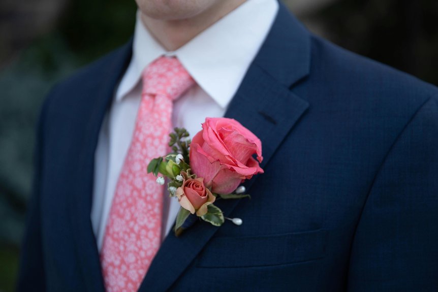
Soft Pink Ties For Modern Warmth
Why does soft pink remain overlooked by so many professionals? I’ve watched colleagues shift their presence by pairing a soft pink tie with a navy suit. Here’s what makes this combination work:
Soft pink ties paired with navy suits create instant approachability while maintaining professional authority and modern sophistication.
- Creates instant approachability while maintaining professionalism and authority
- Works well with white or light shirts to keep balanced contrast and visual clarity
- Textured or patterned options such as subtle stripes add depth without overwhelming your look
- Pairs seamlessly with brown shoes and silver cufflinks for a cohesive, refined ensemble
You’re signaling confidence and modern sensibility. Lighter pink shades fit casual settings best, while patterns keep things interesting. This isn’t about chasing trends; it’s about standing out as someone who understands sophistication. Your navy suit’s versatility becomes your strongest asset.